The Trail Census Dashboard
The goal of the Trail Census dashboard is to make the large volume of count data collected through the Trail Census available and understandable for analysis and decision making. When using the dashboard, refer to the dashboard help, understanding the data, and explanation of single year charts and statistics and yearly comparison charts and statistics, below. Also, annual trail count summary reports are available for each count year between 2017 and 2022.
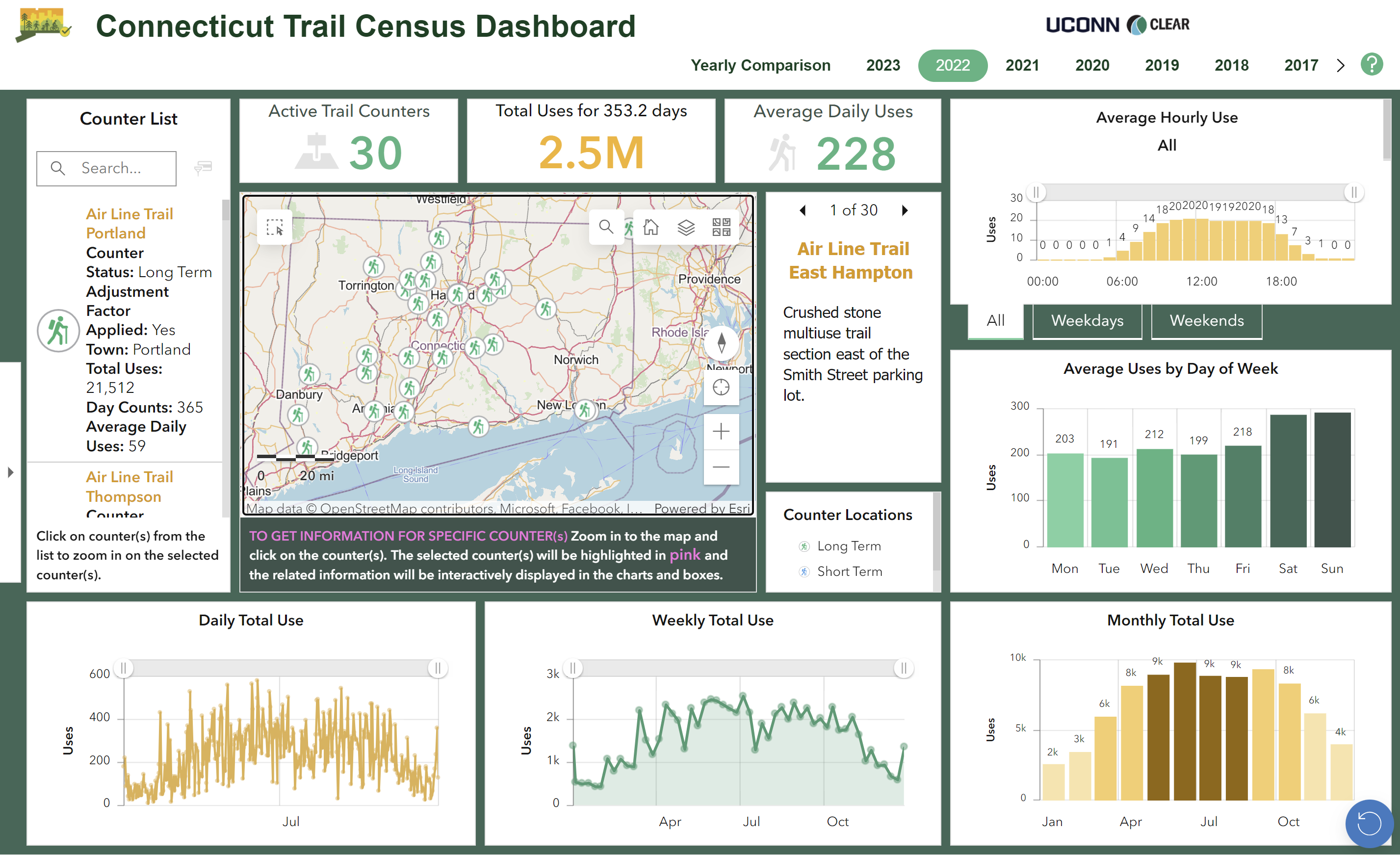
Go To Dashboard
Help Using the Dashboard
For sharing purposes, use the short link https://s.uconn.edu/ct_trail_census
Understanding Dashboard Charts and Statistics
CAUTION! The completeness of datasets presented varies between locations. Not all counters were installed or operated during the same time periods. Additionally, counter malfunction, insects, vandalism and other issues can result in periods of missing data. To assess when and where there is missing or incomplete data:
> In the Yearly Comparison dashboard, select a single counter to see the number of days data was collected for each year. Compiling data from more than one counter can obscure missing data.
> In the Single Year dashboards, select a single counter and look at the “Total Uses for XX Days“ figure above the map. If there are fewer than 365 days of data collection, view the "Daily Total Use" chart (lower left). Any periods with no line indicate no data collection.
Understanding Single Year Dashboard Charts and Statistics
Average Hourly Use
The counts collected in each hour over the 24 hour period are averaged based on the number of days of data collection. There are three options available on different tabs. The first is averaged for all 7 seven days in a week, the second for weekdays only, and the third for weekends only.
Interpretation: Most trails see more use during daylight hours. Trails used for commuting may see increases earlier in the morning and later into the evening.
Tip: Use the slider bar to decrease the range of hours shown on the chart.
Tip: Mouse over the chart to see the hour (24 hour schedule) and value.
Average Uses by Day of Week
The counts collected during each day of the week are averaged based on the number of days of data collection.
Interpretation: Most trails see more use on the weekends. Trails used for commuting may have relatively higher use during the week than primarily recreational trails which see higher uses on weekends.
Daily, Weekly, Monthly Total Use
Counts are summed and then divided by day, week, and month throughout the year.
Interpretation: There is variability in daily use due to many factors, especially weather. There is generally higher use in the warmer months but still significant use during the winter.
Tip: Use the slider bar to decrease the range shown on the charts. A smaller range may show more detail.
Tip: Hover over individual data points to see the actual date and value.
Active Trail Counters
When first opening a dashboard, or when no counters are selected, the Active Trail Counters is the total number of counters in that year. Otherwise, the Active Trail Counters box reflects the number of trail counters currently selected. The Active Trail Counters determine the data on the charts and statistics.
Total Uses for ___ Days
The Total Uses for __ days is the total number of annual uses for selected trails. When one trail is selected, the number of days with data collected during that year will be displayed, along with the total uses recorded on that trail for the year. When more than one trail is selected, the average number of days data was collected for selected counters will be displayed along with the total number of uses recorded at the selected sites in that year.
Average Daily Uses
The Average Daily Uses indicates the average number of daily uses for selected trails for the year.
Understanding Yearly Comparison Dashboard Charts and Statistics
2023 Average Daily Uses Compared to 2017-2019
One question that is asked repeatedly is, how does trail use compare to pre-pandemic levels? The spike in trail use during the pandemic is well documented in this count data and elsewhere. This statistic is designed to answer that question. It compares post-pandemic counts (2023) with the average of 2017, 2018, and 2019 counts (pre-pandemic).
Interpretation: An increase means that trail counts were higher in post-pandemic compared to pre-pandemic levels. A decrease means that trail counts were lower compared to pre-pandemic levels.
Total Uses on Days Monitored, by Year
This chart represents the changes in total counts by year. The green line shows the yearly total uses for selected counter(s) for each year while the yellow line shows the average of the total uses for selected counter(s) for all years. When multiple counters are selected, the green and yellow lines interactively show the sum of yearly totals and “all-years-averaged” totals, respectively.
The total uses can be impacted by missing data. The completeness of data varies between locations because not all counters were installed and operating during the same time periods. Additionally, counter malfunction, insects, vandalism, and other issues can result in periods of missing data. Please see the “Number of Days Monitored by Year” chart for an indication of years with missing data.
For counters with periods of missing data, “Average Daily Uses by Year”, may be a better indicator of trail use over time.
Number of Days Monitored, by Year
Ideally, every counter would collect data for all 365 days. However, due to a variety of reasons including counter malfunction, insects, vandalism, and more, the number of days with data can fluctuate from year to year. When a single counter is selected, this chart clearly indicates when data was missing for that location. When multiple counters are selected, the chart shows the average number of days with data for the selected counters.
Counters may not have been installed or operating for the same time periods. When multiple counters with different year ranges are selected, the day counts and other statistics in the dashboard (e.g. total, average daily/weekday/weekend/month uses) for a given year are only calculated based on the counters that collected data for that year.
Tip: Before viewing multiple counters together, select each one individually and note the years and days of data collection. This may influence the totals when multiple counters are viewed together.
Average Weekday and Weekend Uses, by Year
This chart compares average weekday and weekend uses by year. The total counts collected during weekdays and weekends for each year are averaged based on the number of days of data collection. When multiple counters are selected, the weekday and weekend uses are averaged for the selected counters.
Tip: Before viewing multiple counters together, select each one individually and note the years and days of data collection. This may influence the totals when multiple counters and viewed together.
Total Uses by Month, by Year
This chart shows the variability in monthly uses by year. Two months are combined for each line and then those two-month lines are plotted for each year. For example, the light-green line shows uses in May and June for each year.
The counts are averaged based on the number of days of data collection. When multiple counters are selected, the chart shows the average of the selected counters.
Tip: To take a closer look at the variability, either drag the edges of the chart's box to make it bigger OR click on the expanding arrows in the right corner.
Tip: Before viewing multiple counters together, select each one individually and note the years and days of data collection. The years and days of data collection may influence the totals when multiple counters and viewed together.
Average Daily Uses, by Year
The average daily use is calculated by dividing the yearly total counts by the number of days monitored. The green line shows the yearly average daily uses for selected counter(s) for each year while the yellow line shows the average of all the years for the selected counter(s).
Accounting for the variability in days monitored, the Average Daily Use can reflect variation in trail use over time more accurately than the Total Use.